According to some studies, only 22% of companies are satisfied with their conversion rate. Is that your case? Probably not if you're reading this article!
To compare, know that the average conversion rate of a website is about 2.35%. But the top 10% of companies show conversion rates 3 to 5 times higher (11.45% or more).
Are you below 2%? It's urgent to implement best practices to increase your website's conversion rate. How? Here are 15 techniques!
Preamble: what do prospects want?
Nowadays, qualified prospects are those who come to you because they have a genuine interest in your offers. That means they're ready to trade their email address for content that helps them solve a problem.
Generally, these leads have the budget suited to their ambitions and understand the value of your services for reaching their goals. You need to support them effectively in their decision so you become their preferred choice and convert them into customers.
How? That's what we'll look at in this article…
Why does your site have a low conversion rate?
Your website is a wonderful way to communicate with your customers. Its goal is to engage them and help solve a pain point. When perfectly built, it becomes a true conversion machine…
If you feel that your conversion rate is not at its maximum, then there's a small problem somewhere! A closer look at the 6 main reasons preventing your visitors from converting.
If your conversion rate is lower than expected, look at these reasons to improve your site.
1. Your website doesn't inspire trust
Are all the criteria in place to convince visitors of the quality of your products/services and the reliability of your company?
To inspire trust, your website must be modern, smooth, and include legal notice, as well as terms and conditions of sale (for an e-commerce site).
But that's not all, various elements affect trust:
- The presence of an "About Us" page
- Quality images and text
- Clear, prominent contact methods
- A regularly updated blog (with useful content)
- A An active presence on social media
- Customer reviews or testimonials on your product pages
2. Your content is low quality
If your site isn't converting, it may be because visitors can't find the information they're looking for.
So ask yourself this question: what are your clients looking for when they turn to you?
With the answers, you'll have material to create content that meets your prospects' needs. Be useful above all.
3. Your offers and added value are not clear
Be clear enough about your offers and the benefits they provide.
State precisely why your services are suitable for your visitors. What do they do for them? What results can they get by choosing you?
Visitors need to be convinced that you can meet their expectations precisely.
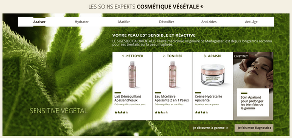
Source: Yves Rocher
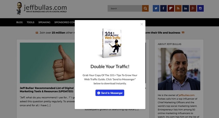
4. You don't offer anything valuable in exchange for prospect data
You ask prospects to subscribe to your contact list, but what do you offer them in return?
People rarely give their contact details spontaneously. They need to be convinced of what they'll get in return.
Take the time to prepare premium content, such as a white paper, a training video, or a methodology that addresses your market's needs.
Offer it as a free download, with a persuasive text that encourages your prospects to leave their contact details. Which brings us to the next point…
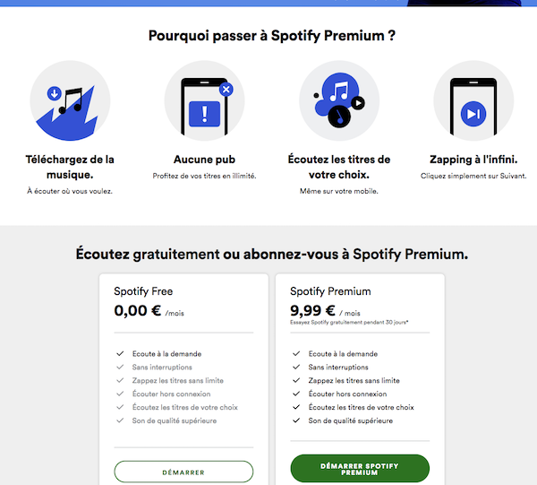
Source: Spotify
5. Your forms are too long or too complex
Nobody wants to make life complicated, especially on the web (think about your mobile visitors!).
To convert as many prospects as possible, your forms should be simple and short.
Keep only the fields necessary to segment your prospects. In addition to first name, last name and email address, you can ask for one or two additional pieces of information (age, job title, company size, place of residence…), but no more!
6. You have no call to action on the site
No call to action? In that case, your site doesn’t convert because there’s no message encouraging conversion.
Clearly state what you expect from prospects: downloading a white paper, booking an appointment, requesting a quote, signing up for a trial period… And add visible banners in strategic places on your website.
The more your visitors are encouraged to act, the more your conversion rate will increase.

Source: Netflix France
1. Shorten the conversion funnel
The more effort your site visitor has to provide, the less likely they are to convert.
Instead of forcing them to fill out a form, simply collect the email address to start. From there, you will obtain more information through email campaigns.
Similarly, rather than asking the user to create an account on an e-commerce site, allow guest checkout.
Finally, simplify form filling by offering a third-party sign-up service like Google or Facebook. That way, the visitor can quickly log in with existing credentials.
2. Apply Hick's law
What is the Hick's law ? It's a theory that the time an internet user needs to make a decision is directly linked to the choices available to them. In other words, increasing the number of choices lengthens decision time, which is bad for your conversion rate.
Make sure to limit the possible options in your offers. Also, simplify the design, as well as boxes and links in the navigation bar. If the user has to browse through too many elements, they may leave the site.
Regarding calls to action, stick to placing only one per page. Why? To focus each piece of content on a single objective.
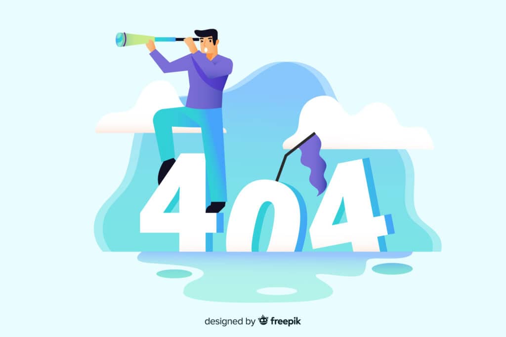
3. Optimize error pages to encourage conversions
Even if you do everything you can to ensure your website pages never go down, it can still happen. However, you can turn your site's downtime into a positive experience. How? By presenting a creative error page.
Instead of a standard error message, innovate with a fun illustration containing a humorous caption. Then add an equally engaging call to action to redirect the visitor back on track.
You can also offer a search bar so they can immediately find what they want.
4. Run A/B tests based on visitor type
Each visitor behaves differently. For example, organic visitors spend more time on the website, view more pages, and generally have a lower bounce rate than visitors from paid campaigns.
These behavioral differences surely reflect on other aspects of the website. So, test different forms, landing pages, headlines, or calls-to-action depending on where your visitors come from. You will be able to improve the return on investment of your organic SEO and marketing campaigns.
5. Add a call-to-action to all your blog posts
Every blog post you write should focus on your prospects, their problems, and the burning questions you can answer. Consequently, each article is tied to one of your solutions. So, make the connection explicit!
At the end of the text, invite readers to learn more about the topic discussed by directing them to downloadable content, a webinar… If you cover a topic in general terms, invite visitors to subscribe to your newsletter so they don't miss any updates.
6. Offer a preview from the CTA
Optimizing calls to action is the most basic, yet most important thing to do to increase conversion rate.
Using active language instead of a generic, passive term can significantly improve clicks. For example, replace:
- "Read more" to "See product details"
- "Find a store" to "Where to buy?"
- "Product categories" to "Discover other products"
By giving your user a preview of what to expect when they click, they will be more inclined to interact with your call-to-action.
7. Ask for small commitments
In a PlaybookGoogle recommends not pushing potential customers too hard to commit. According to the search engine, most users fear commitment. They may be interested in your product without being ready to make a decision.
Even if you use active language, you can minimize the commitment requested.
For example, replace “Buy now” with “Speak to an advisor” or “Request a free consultation.” This reassures the customer that the next step before a decision will be a conversation, not a transaction.
8. Optimize highly convertible pages
Which pages attract the most visitors? Which ones do visitors spend the most time on before converting? Identifying high-performing content gives you the opportunity to increase conversion rate.
On those pages, place links to conversion content (product sheets, landing pages, white papers…), calls-to-action, or forms. They are also perfect places to implement live chat or encourage booking an appointment.
9. Use pop-ups responsibly
Internet users hate pop-up windows that interrupt their browsing experience. Especially on mobile. However, the pop-ups are an excellent way to acquire leads.
When inserted respectfully and responsively, these windows can help you generate additional sales.
Through this window, encourage them to sign up for your newsletter or download a white paper.
10. Activate a chatbot
When a visitor is interested in a product or service, they want answers to be fully convinced.
Are you thinking about your FAQ page ? It is useful, but not sufficient! This page offers no interactivity and easily bores leads. Never forget that they are in a hurry — they want immediate answers. To turn them into prospects, you must match their pace.
The chatbots prove to be playful companions for answering users' questions. They can give them your opening hours or contact details, guide prospects to the product best suited to their needs, or provide them with additional information.
Furthermore, chatbots rely onartificial intelligence. They become increasingly sophisticated as they process information. You can use them to gather insights into what users think, then use that data to optimize your content strategy and create a better conversion funnel.
11. Check your mobile layout
We hope you've already switched to a responsive design. But if not, we'd like to remind you of the importance of a mobile-friendly site!
Google favors sites with a mobile version when displaying results. Also, remember that more than half of global internet traffic is carried out via smartphones!
So, if you want to capture your prospects right at the entry of the conversion funnel and lead them to purchase, you absolutely must have a functional mobile site. If this isn't done, consider hiring a developer getting help.
12. Place your CTA in the right spot
Your CTA button must have a prime position on the page; it should stand out and attract the visitor's attention. What will happen when the visitor clicks this button and what are the benefits of that action?
This text doesn't have to be on the button itself, but it should be nearby.
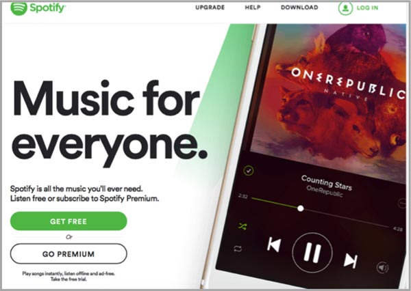
Take a look at the CTA used by Spotify. The benefit is clear: "music for everyone" and "it's all the music you'll ever need." When the visitor clicks the button, they will "play songs instantly," and the "Free" button allows the consumer to get a free trial.
Buttons are simple, but the text around them explains what will happen if the visitor clicks one of them.
13. Use the right colors
MRIs have shown that different parts of our brain are stimulated by colors, and that these colors have a specific and different effect on men and women.
Women, for example, prefer green, blue, purple and pink. Men prefer blue, green and black. Each color also represents certain actions.
Even if this may not be an element that guarantees a purchase, why not use button colors that speak to the people you are targeting?
14. Appeal to your visitors' emotions
This is where the sales psychology traditional techniques come into play. Pain must be relieved, a sense of belonging can be created, emotional appeals can be made and a sense of urgency can be instilled.
Your buttons and the text around them, for example, will use messages like: "More than 18 hours left to take advantage of this special price", "Limited stock", "Join thousands of other buyers" or "Get your free trial today."
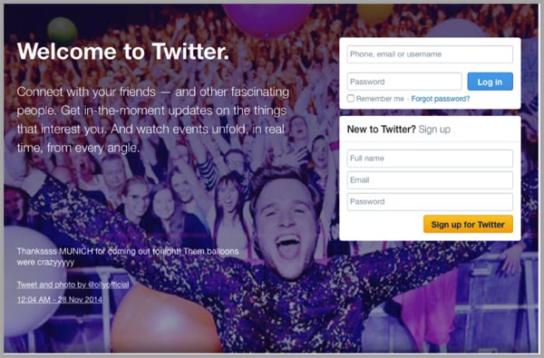
See how Twitter makes an emotional appeal with excitement. There’s a huge crowd of excited people. The excitement comes from the concert, not from joining Twitter, but that doesn’t matter!
15. Refine your CTA
The design of your call-to-action buttons is important. If you haven’t read our article on best practices to follow for an effective call to action, let’s recap a few simple rules here:
- Use buttons with rounded corners rather than square ones. Neuroscientists say rounded corners draw our eyes and attention inward, while square corners direct them outward.
- Visitors pay more attention to large buttons, so if you have an important CTA, make it large.
- Place your 'benefit' on the button and put it at the center of your page, above your content.
- Use a simple call-to-action verb to prompt clicks.
- Customize your button text to stand out.
Conclusion
With all the effort to attract visitors to your website, it’s essential to improve navigation to encourage conversions. Implement these 15 techniques to better convert your visitors starting today!
Experiment with A/B testing tools to identify the factors that most affect your conversion rate.
Also don’t forget to consider the SEO (do your pages rank for targeted keywords?) and usability (page load times, an overly detailed menu…).
And if you want a professional opinion, head to Codeur.com to post your requirements!