La gestion de la ligne de flottaison est une partie importante dans la conception de site web.
Quels éléments placer au dessus de la ligne de flottaison ? Quel impact sur le référencement naturel ? Quid de la différence entre mobile et desktop ?
Concept souvent négligé, la ligne de flottaison requiert toujours la considération des créateurs de sites web pour offir une bonne expérience utilisateur.
Qu’est-ce que la ligne de flottaison ?
Le concept de la ligne de flottaison, « Above the fold » en anglais, remonte à des siècles, aux débuts de l’imprimerie. « Above the fold » signifie « au-dessus du pli ». Les journaux, en raison de la façon dont ils étaient imprimés sur de grandes feuilles de papier, étaient pliés une fois qu’ils arrivaient dans les kiosques à journaux. De ce fait, seule la moitié supérieure du papier est visible pour le passant.
L’industrie de la presse s’est vite rendu compte que pour capter l’attention des lecteurs, elle doit présenter des titres, du contenu et des images qui attirent l’attention dans la moitié supérieure de la page. Ce principe de base reste le même pour le contenu numérique.
Bien sûr, les sites Web n’ont pas de pli physique comme les journaux. Ici, le « pli » se rapporte à la barre de défilement. Tout ce qui n’est pas visible immédiatement, et qui nécessite de scroller, est donc considéré sous le pli, sous la ligne de flottaison.
Malheureusement, le concept de ligne de flottaison n’est pas aussi simple que sa version papier. En effet, comment connaître où se trouve la ligne de flottaison quand, de nos jours, aucun écran n’est identique à un autre ?
Depuis l’avènement des tablettes et autres smartphones, chaque site se présente de façon très différente selon l’internaute. Sans parler des problèmes de résolution d’écran, de navigateur, de type d’écran (OLED, Retina, etc).
Les smartphones, qui représentent désormais une très grande part du trafic web, se présentent sous différentes formes et tailles, de même que leurs écrans, et leur résolution. Contrairement à un journal papier, la ligne de flottaison est un concept beaucoup moins prévisible.
Voici l’exemple d’une ligne de flottaison mal gérée, avec un contenu coupé.

Comment gérer la ligne de flottaison ?
S’il est vrai qu’il n’y a pas de règles strictes pour ce qu’il faut afficher au dessus de la ligne de flottaison, certaines pratiques constituent souvent des lignes directrices utiles.
Certaines sont des idées de bon sens, comme celle de s’assurer que le contenu le plus engageant est au-dessus de la ligne de flottaison. Vous pouvez aussi choisir de designer votre site selon les tailles les plus courantes de chacun des supports – bureau – mobile – tablette. Un site responsive, c’est aujourd’hui la norme !
Il est toutefois important de ne jamais prendre les « meilleures pratiques » au pied de la lettre. Pendant de nombreuses années, les sites Web ont été conçus comme les premières pages des journaux, mais cela a conduit à une sorte de “templatisation”, où la majorité des sites se ressemblaient.
Les innovations, comme les sites « one-page », ont notamment commencé à s’affranchir du concept, et fournissent une expérience beaucoup plus naturelle pour le lecteur.
Si vous souhaitez rester sur un concept simple, et qui ne changera pas de sitôt, placez vos informations importantes : image choc, punchline, call-to-action, le plus haut possible dans vos pages. Le contenu le plus important, en premier.
Attention, il faut garder un équilibre et ne pas TOUT mettre non plus, au risque de rendre votre page confuse.
Exemple de gestion de la ligne de flottaison
Pour bien comprendre comment il est possible de gérer intelligement la ligne de flottaison d’un site, analysons un exemple.
Exemple de ligne de flottaison sur desktop
Par exemple, sur notre plateforme freelance Codeur.com, les éléments les plus importants sont situés au dessus de la ligne de flottaison :
- Le menu de navigation pour s’inscrire
- Une accroche forte
- Un CTA au format barre de recherche
- Des éléments de réassurance
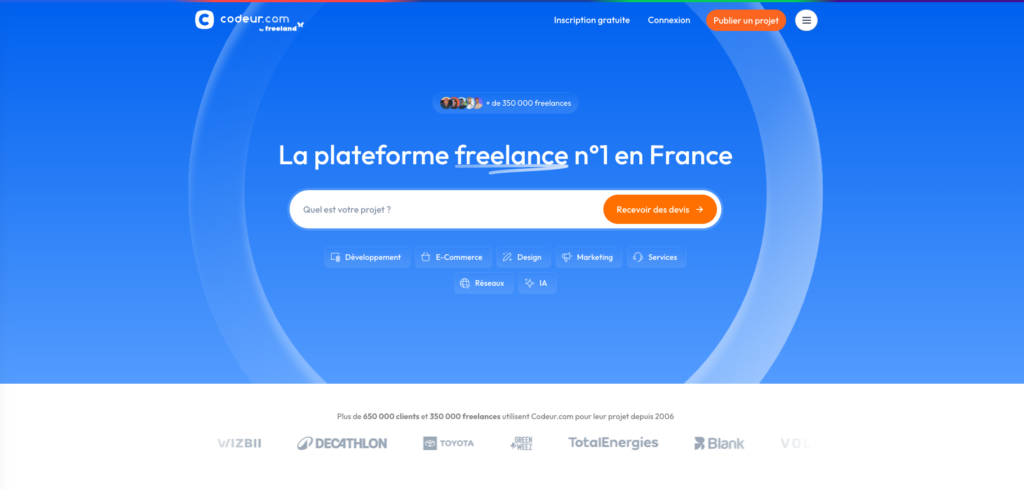
En prévision d’un écran aux dimensions plus petites ou avec un ratio différent du 16:9, il n’y a pas trop d’éléments sur la largeur. De même, le bandeau de réassurance blanc est discret. Lorsqu’il est visible, il tranche avec le fond bleu et est visible, mais il ne manque pas et ne choque pas s’il n’est plus visible ou coupé.
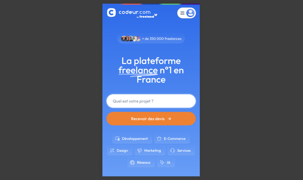
Exemple de ligne de flottaison sur mobile
En version mobile, l’affichage du contenu est adaptée pour correspondre au format.
La barre de recherche avec CTA est séparée est deux, mais l’ensemble des mêmes éléments sont présents au dessus de la ligne de flottaison.
La gestion de la version mobile d’un site internet est primordiale, car de très nombreux internautes naviguent exclusivement sur mobile. Il est donc important de vérifier dans votre outil analytique (Google Analytics, Matomo…) quelle est la part de navigation mobile et desktop et de vérifier que votre site est bien optimisé.
Optimiser le contenu au dessus la ligne de flottaison de son site web
Il existe de nombreux outils en ligne pour vous aider comme la carte thermique. Une carte thermique recueille des données auprès des utilisateurs en temps réel sur la façon dont ils interagissent avec le site Web et affiche les résultats à l’aide de différentes couleurs comme le rouge foncé mettant en évidence la partie de la page fréquemment utilisée, le jaune pour les parties moyennement utilisées et le vert clair pour les sections les moins utilisées.
Cela permet de voir comment interagissent les internautes avec le contenu de votre site. Le mauvais positionnement d’un CTA au dessus de la ligne de flottaison, par exemple, peut diminuer votre taux de conversion.
Ne négligez pas la ligne de flottaison
Concept abstrait quand on ne le connait pas, la ligne de flottaison ne disparaîtra pourtant jamais.
Avec un site responsive, et en plaçant seulement les choses les plus importantes sur le premier écran, vous aurez la plupart du temps un rendu correct. Mais il est essentiel de s’assurer que son site performe au dessus de la ligne de flottaison !
Si vous envisagez de faire une refonte de votre site internet ou que vous avez besoin d’optimiser vos pages au dessus de la ligne de flottaison, faites appel à un expert.
Déposez gratuitement un projet sur Codeur.com pour vous faire accompagner par un développeur web freelance !