Une étude d’Aberdeen Group montre qu’avec un tableau de bord, 48 % des dirigeants d’entreprises trouvent eux-mêmes les informations importantes, sans l’aide d’un collaborateur. 74 % d’entre eux peuvent rapidement prendre les décisions stratégiques au meilleur moment. Un vrai gain de temps et de productivité !
La mise en place d’un dashboard facilite la data visualisation (ou visualisation de vos données) en se servant de diagrammes, graphiques, cartes, icônes… Via une interface graphique simple, vous pouvez avoir une compréhension précise et profonde de l’état de santé de votre entreprise et de la progression vers vos objectifs.
Vous voulez savoir comment construire un dashboard qui facile la data visualisation ? Découvrez nos conseils dans cet article, ainsi que 6 outils pour créer des tableaux de bord efficaces !
Le dashboard, la représentation visuelle de votre performance
Tout d’abord, voyons ensemble le concept de dashboard, ou tableau de bord en français. Cet outil vise à suivre et présenter tous les indicateurs clés de performance (KPI) de votre entreprise en un seul endroit. Ce qui permet de surveiller la santé de votre activité, d’un service ou d’un processus spécifique.
En effet, pour être pleinement efficace, nous vous conseillons de le diviser par département ou objectif : marketing, financier, RH, gestion commerciale…
Le dashboard se sert de la data visualisation pour simplifier les ensembles de données complexes. Au lieu de passer en revue les colonnes ou les lignes d’une feuille de calcul, vous pouvez directement analyser vos données via un tableau, un graphique ou des diagrammes.
Pour ce faire, le tableau de bord rassemble des données provenant de diverses sources. Il se connecte à vos fichiers (une feuille de calcul Excel, par exemple), à vos pièces jointes et à vos outils (comme un CRM ou une plateforme de marketing automation).
Il est donc pleinement personnalisable pour répondre à vos besoins et vous aider à atteindre vos objectifs d’entreprise. Vous pouvez donc choisir les données à afficher, ainsi que le modèle à utiliser pour visualiser les chiffres.
Pourquoi le tableau de bord est-il important ?
Le dashboard est un outil précieux pour une prise de décision planifiée et fondée sur les données. Ces dernières sont transformées en informations et en rapports exploitables faciles à lire, ce qui évite les erreurs d’interprétation, tout en faisant gagner du temps.
Bien qu’il puisse servir à plusieurs choses, l’objectif premier du tableau de bord reste de vous fournir une visibilité totale de votre activité. Vous savez, à tout moment, ce qu’il se passe dans votre entreprise, ce qui fonctionne ou pas.
Par exemple, votre dashboard commercial peut vous montrer exactement le volume de ventes depuis le début d’année, le nombre d’opportunités manquées ou, au contraire, qui ont généré des conversions, le nombre de RDV pris par les commerciaux, etc. Vous détectez vite l’efficacité de votre force de vente et les éventuels points de friction à corriger (par exemple, si le nombre d’appels qui n’aboutissent pas à un RDV est plus élevé qu’à l’accoutumée, il y a sûrement des correctifs à faire).
Parmi les autres avantages, citons :
- La possibilité d’identifier des tendances
- Un moyen facile de mesurer l’efficacité de vos services
- La possibilité de générer des rapports détaillés en un seul clic
- La capacité de prendre des décisions plus éclairées
Les différents types de dashboards
Qu’il s’agisse de Business Intelligence, de marketing, de ventes ou de finances, les tableaux de bord peuvent être classés en 3 catégories :
Le tableau de bord opérationnel
Généralement utilisé par les usines de production, le tableau de bord opérationnel offre un aperçu complet et instantané des performances liées à des opérations de la journée. Les données qu’il contient sont mises à jour en temps réel.
Le tableau de bord stratégique
Ce type de tableau de bord est utilisé pour aligner les performances des départements sur la stratégie globale de l’entreprise. Il sert à examiner les données de performance du dernier trimestre, par exemple, et les compare à la période actuelle.
Les données des tableaux de bord stratégiques sont statiques pour une période donnée et sont mises à jour moins fréquemment que les tableaux de bord opérationnels.
Le tableau de bord analytique
Un tableau de bord analytique contient une grande quantité de données créées et destinées aux dirigeants. Il fournit à l’entreprise une vue d’ensemble complète des performances, sert à identifier les tendances, comparer les données et créer des prédictions ainsi que des objectifs.
À lire aussi : 6 raisons d’utiliser Google Data Studio pour vos reporting
Comprendre la data visualisation utilisée dans un dashboard
Pour faire simple, la data visualisation constitue une représentation graphique des données. Elle présente ces dernières sous la forme d’une image ou d’un graphique pour faciliter l’identification de schémas et la compréhension de concepts difficiles.
Grâce à la technologie, vous pouvez rendre la data visualisation interactive en créant des dashboards sur lesquels les utilisateurs peuvent cliquer pour voir plus de détails, par exemple.
Les atouts de la data visualisation
La data visualisation reste un moyen efficace de partager universellement des concepts complexes. Pourquoi ?
- Les visuels sont plus efficaces que le texte : « une image vaut mille mots », c’est bien connu !
- Les diagrammes et les graphiques transmettent les informations plus rapidement qu’une feuille de calcul volumineuse ou un rapport : surtout quand on sait qu’en moyenne, les entreprises se servent de 400 sources de données gérées dans 6 outils différents (d’après IDC et Gartner).
- Les métaphores visuelles sont un langage universel : si vous travaillez avec différentes nationalités, tout le monde aura la même compréhension de l’information.
Les techniques utilisées dans la data visualisation
Pour présenter les données dans les tableaux de bord, plusieurs techniques sont utilisées comme les graphiques linéaires, les diagrammes, les cartes… Tout va dépendre de vos besoins.
Les graphiques linéaires vous montrent des résultats à l’instant T, mais peuvent aussi vous aider à comparer des périodes. Les diagrammes présentent des répartitions, tandis que les cartes montrent des tendances. Le tout est de trouver le modèle qui va retranscrire au mieux l’information nécessaire à vos décisions.
La clé, pour choisir le format de tableau de bord adapté, est de vous poser ces questions avant l’édition de chaque graphique :
- Quelle est la donnée qui doit être mise en avant ?
- Ai-je besoin de la comparer à une autre ? Si oui, laquelle ?
- Pour qui l’information doit être présentée ?
Cette dernière question est essentielle, car les collaborateurs n’ont pas tous besoin du même niveau d’information. Alors qu’un dirigeant peut se contenter de KPI globaux sur les revenus générés, le responsable des ventes voudra sûrement connaître les performances de chaque point de vente ou de chaque commercial.
6 outils dashboard à utiliser pour analyser vos données
Pour créer vos tableaux de bord et améliorer le pilotage de votre entreprise, il existe des outils complets pour créer des dashboards visuels. Tour d’horizon de nos 6 outils préférés !
Les outils de dashboards gratuits
Commençons avec les outils gratuits pour mettre en forme vos tableaux de bord.
1. GoogleCharts
Basé dans le cloud, le service GoogleCharts vous permet de créer des graphiques linéaires, cartes et diagrammes, afin d’afficher vos principales données de manière claire et compréhensible.
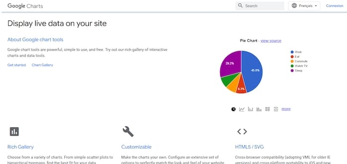
Dynamique, il vous permet d’obtenir des informations en temps réel. Ce qui est pratique pour prendre des décisions rapides et éclairées.
Enfin, Google Charts présente une bibliothèque de graphiques dans laquelle puiser pour présenter au mieux vos données. Chaque modèle peut être entièrement personnalisé selon vos besoins.
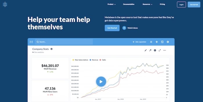
2. Metabase
Outil de data visualisation avancé, Metabase vous permet de construire des dashboards sur-mesure. Doté de fonctions collaboratives, il permet à tous les membres de votre équipe de créer, partager et organiser des données. Parfait pour suivre les performances de vos différents services.
Vous pouvez le connecter à pratiquement toutes vos sources de données : Google Analytics, serveurs Apache, base de données SQL, plateforme cloud…
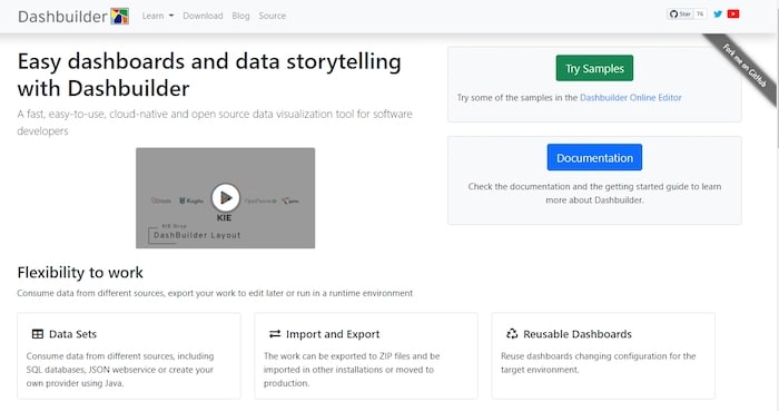
3. Dashbuilder
Que vous souhaitiez créer des tableaux de bord statiques ou dynamiques, avec des données en temps réel, vous pouvez utiliser Dashbuilder ! Fonctionnant avec Java, il vous offre la possibilité d’extraire des informations à partir de vos tableaux, de vos fichiers texte et de vos bases de données.
Vous pourrez partir de modèles existants ou créer vos propres graphiques, de A à Z.
Les dashboards payants
Pour des fonctionnalités plus avancées, nous vous recommandons ces outils de création de tableau de bord.
4. Tableau
Avec Tableau, vous actualisez automatiquement votre dashboard avec des données provenant d’applications telles que Google Analytics ou Salesforce (qui est le créateur de cet outil, d’ailleurs).

Son atout ? Offrir des niveaux aux utilisateurs : créateur, explorateur ou spectateur. Ainsi, vous pouvez collaborer sur les tableaux de bord, mais aussi les partager à des équipes externes, partenaires et clients.
Prix : 42 $ utilisateur/mois (facturation annuelle)
5. Klipfolio
Application basée dans le cloud, Klipfolio permet de créer et de partager des tableaux de bord, mis à jour en temps réel, sur le web, via des écrans de télévision et sur des appareils mobiles. Elle se connecte à plus de 100 applications comme Twitter, Moz, Pingdom, Salesforce, Google Analytics, Instagram, Xero, etc.
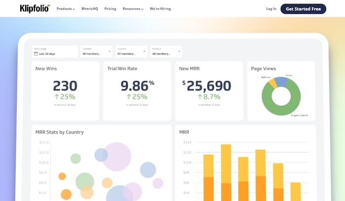
La particularité de Klipfolio ? Vous pouvez créer vos propres formules, pour croiser des données, et générer des tableaux de bord correspondant totalement à vos besoins.
Prix : À partir de 24 $ / 5 utilisateurs
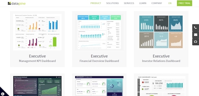
6. Datapine
Datapine vous permet de visualiser et de surveiller vos indicateurs clés de performance les plus pertinents en un seul endroit. Outil vraiment puissant, il propose des analyses avancées, à partir de formules personnalisées en fonction de vos activités.
Vous pouvez aussi programmer des rapports automatisés, afin de gagner du temps, et élaborer des tableaux de bord interactifs.
Autre point intéressant dans cet outil : grâce à l’intelligence artificielle, Datapine détecte des tendances, pour éliminer les approximations dans vos décisions commerciales.
Prix : À partir de 249 $ par mois + 55 $ par utilisateur/mois
Notre astuce pour créer des dashboards
Les dashboards occupent une place importante dans la croissance d’une entreprise ou d’un département en particulier. Cependant, récolter des données et créer des tableaux de bord restent des tâches chronophages. Le secret ? L’automatisation ! En automatisant vos reportings, vous bénéficiez d’informations constamment à jour pour piloter au mieux votre activité.
Nous vous conseillons de faire appel à un freelance expert en analytique pour vous aider à gérer vos dashboards et l’analyse de vos données. Postez une annonce dès maintenant sur Codeur.com pour trouver un consultant analytics qui pourra vous accompagner pour mettre en place des dashboards et booster votre business !